
")
As life expectancy increases, more of us are having to deal with symptoms collectively known as dementia. This includes difficulty with memory, perception and the processing of colour and coloured surfaces.
How do environments impact on life with dementia?
For those with dementia, ‘visuospatial difficulties’ are commonplace. Cluttered or brightly coloured interiors can trigger confusion and frustration. Conversely, a lack of definition or contrast can have the same effect. Getting the balance right is difficult, but optimum levels can be achieved.
Developed in partnership with leading academics and care professionals, The Remini Dementia Collection from Furncare is an exclusive new furniture collection specifically for those living with the condition. It includes a range of specially designed bedroom interiors with four distinct room schemes to accommodate individual tastes and styles.

Definition and contrast
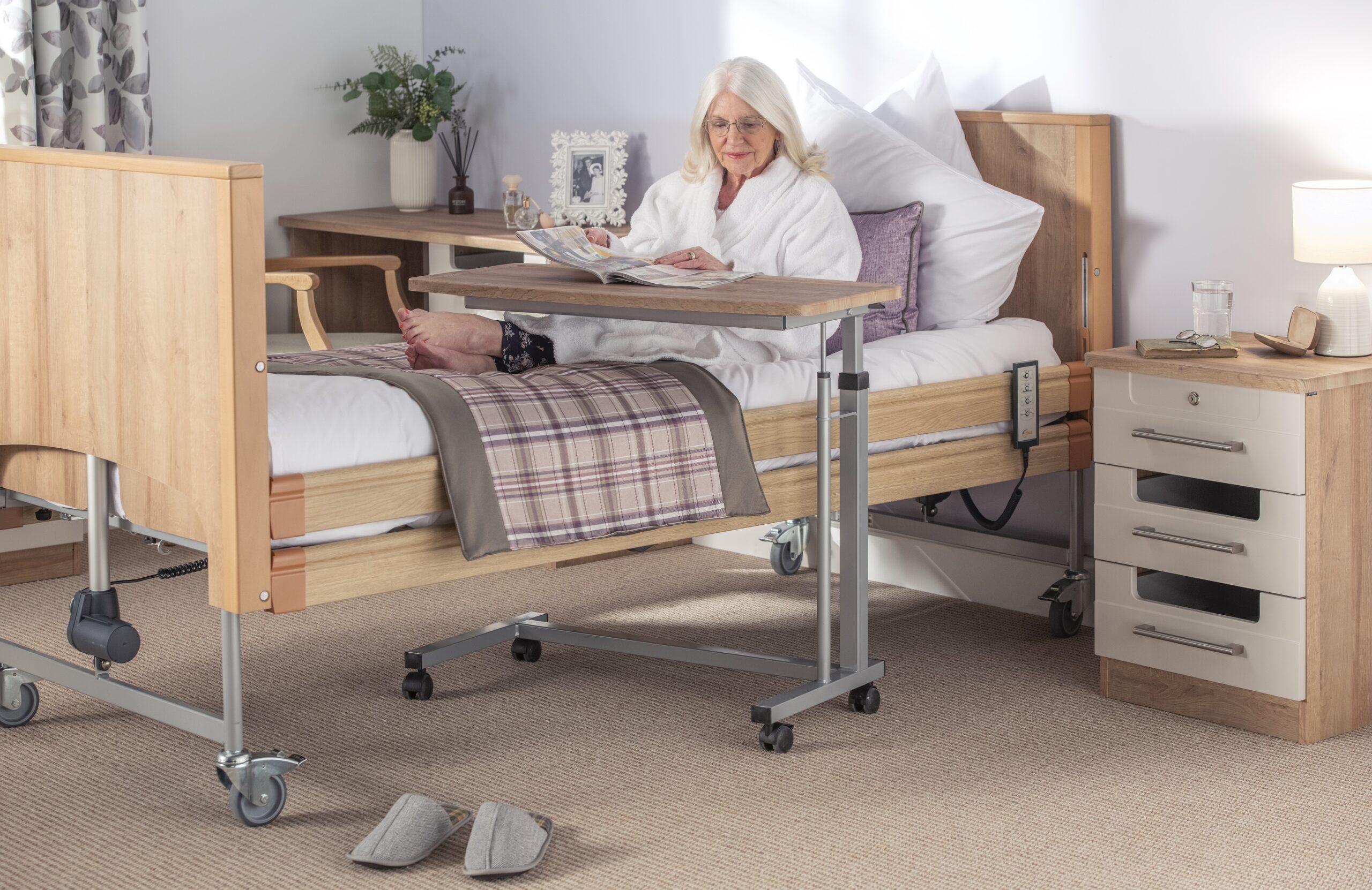
An unreliable memory is a widely recognised symptom of dementia, as is confused spatial orientation. Some may forget what’s inside a drawer whilst others may be unable to open it. That’s why special cut-outs feature in Remini furniture soft-close doors and drawers. This enables residents to see what’s inside without having to open them.
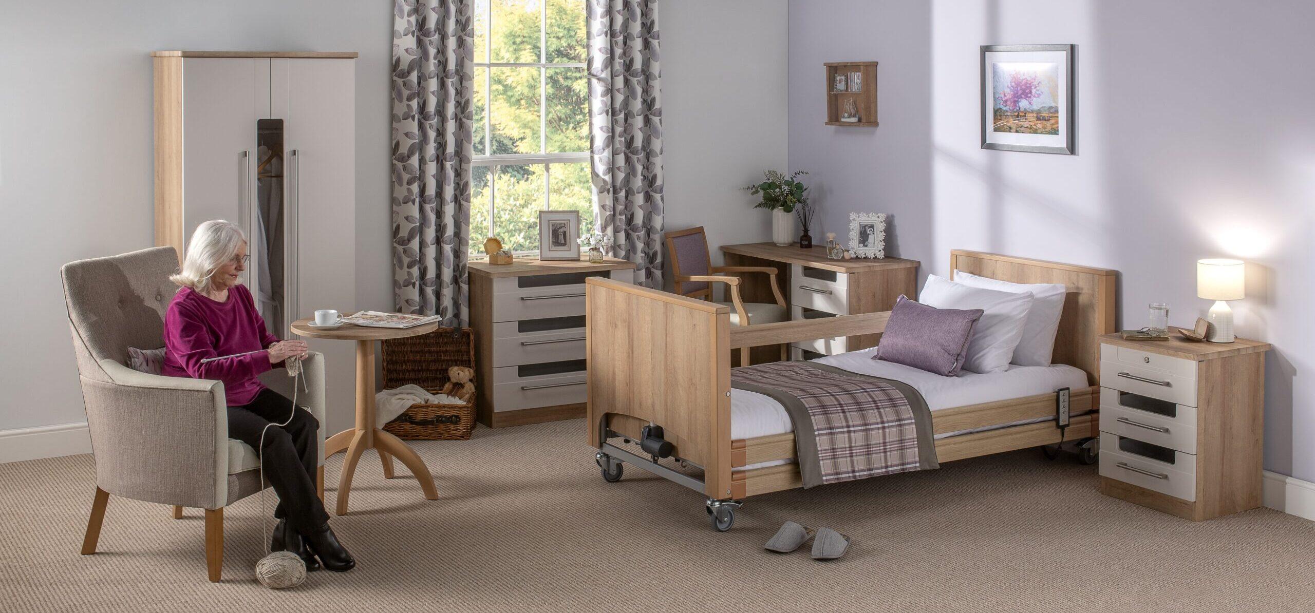
Whilst cut-outs in the wardrobes, cabinets and dressing tables provide a simple way to open drawers and doors, users will be more familiar with conventional handles. They’ve been incorporated too, as a comfortingly familiar alternative way to access what’s inside.
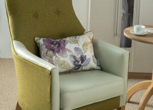
Remini furniture features rounded edges and is finished in contrasting colours and textures. Drawer fronts and doors are matt grey, whilst cabinets are finished in natural oak. This distinction and the contrast it provides is invaluable. Similarly, contrasting fabrics are used in the upholstery of the seating. Even the cushions feature contrast piping to help users process the shapes and edges. All fabrics are fire retardant, water and stain resistant.
Seeing the light
With age, more light is needed to see, and glare can be a problem. When selecting colour schemes for those with dementia, ‘Light Reflective Values’ are important. Referred to as LRV, this measures how much light is reflected or absorbed by a surface. Black has an LRV of 000 whilst white has an LRV of 100.
For those with dementia, visuospatial processing can be helped by factoring sufficient contrast in to surfaces. If tonal values of furniture and the wall behind are too similar, the furniture itself can be difficult to see. An LRV difference of 30 points between adjacent objects will help residents to distinguish between them. Any less can have the opposite effect.
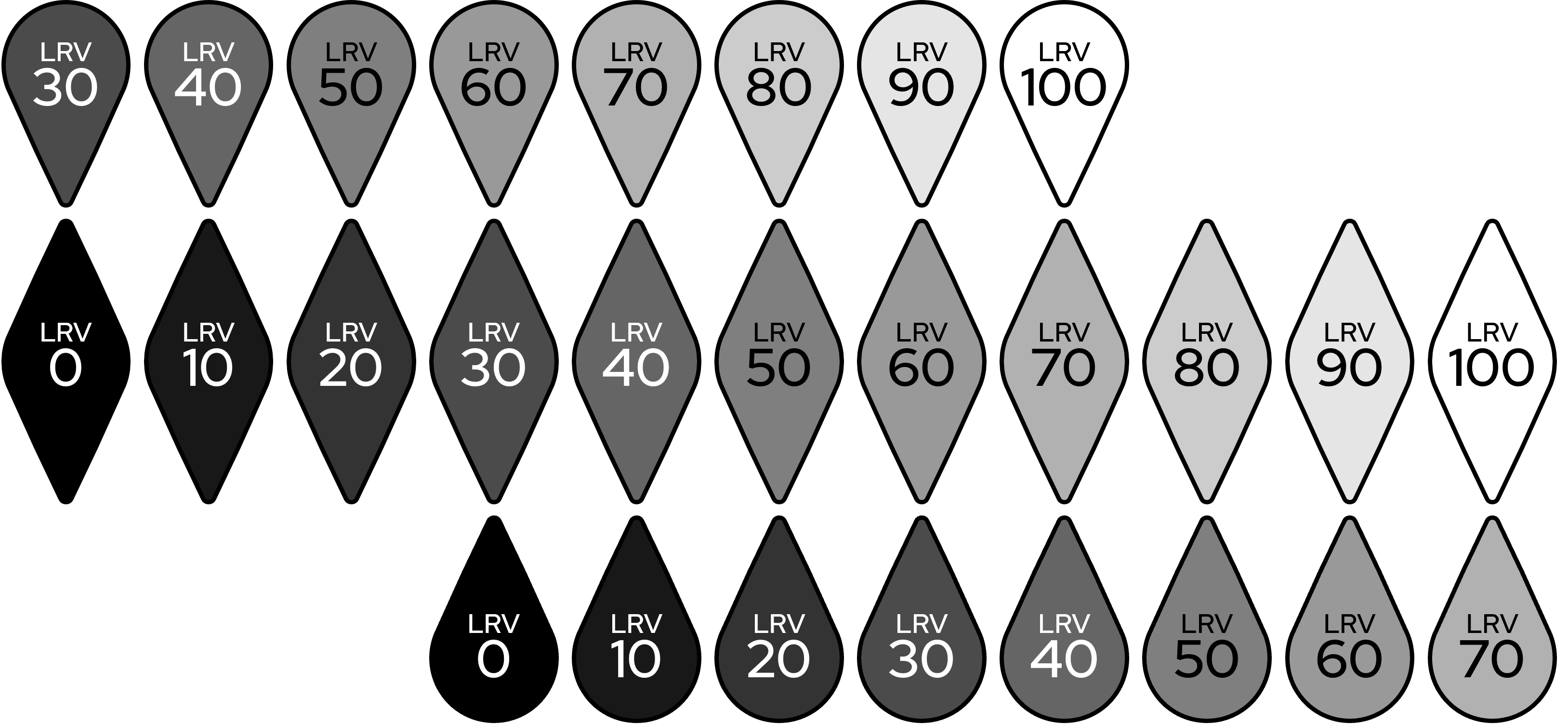
The Remini Dementia Collection from Furncare features coordinated interiors and quotes LRV ratings for each item. It recommends complementary wall and floor coverings for perfectly balanced LRV interiors for those with dementia.
Download the new Remini brochure here. The Collection can be viewed at our Showroom – click here to schedule a visit.
Alternatively, speak to a friendly Furncare consultant on 01603 664900 or email sales@furncare.co.uk